In 2015, the web saw mobile access edge past desktop usage for the first time ever. This has massively impacted the designers of the world, who have rushed to adapt to the quickly shifting landscape. Now we set our sights on developing a mobile-first mentality, as we examine 7 of the top web trends in 2016.
Responsive Design
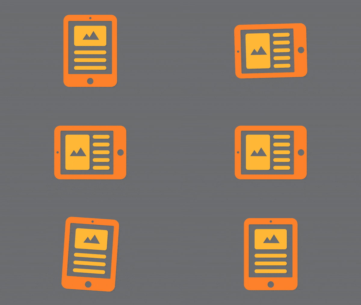
While it’s no secret that ‘mobile-friendly’ design is on the rise, many developers still view it as a premium or optional feature. With the new majority of users electing to browse the web from their couch or passenger seat, the time to make the shift to responsive design is now.
When creating a responsive framework, make sure your layouts are defined by percentages, rather than static pixel dimensions. There are now so many types of devices ranging in screen size and resolution that it would be impossible to accommodate them all.
Material Design
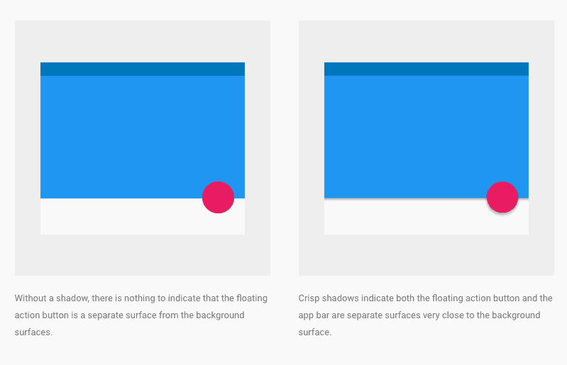
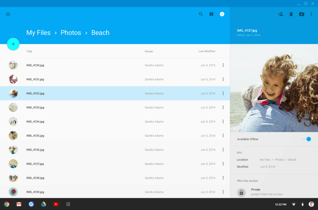
While we have all noticed the trendy ‘flat’ design style of recent years, many have not heard of Google’s curated style language, called “Material Design”. In short, their aim was to elevate the trendiness of flat design beyond its kitschy trappings, and incorporate depth, shading, and movement to an otherwise lifeless 2D universe. Though the design system is far too vast to go into any great detail here, designers would do well to incorporate the concepts laid out in Google’s Material Design Guide.
Typography
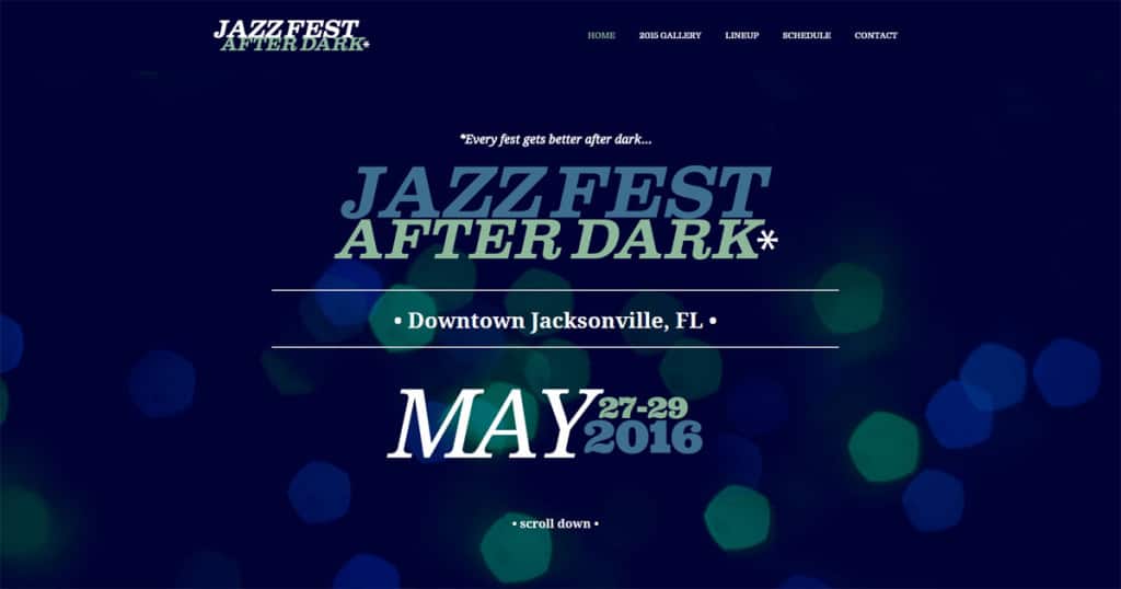
Though web content is now largely driven by imagery, typography has made a strong comeback in recent years. It’s not uncommon to see entire Instagram accounts dedicated to hand-drawn type pieces, filled with inspirational and humorous phrases. Allowing attractive or animated type to take center stage on a website is an excellent way to catch your audience’s eye, while staying on message. The Nuera team recently opted for this strategy while creating a website for a music festival called Jazz Fest After Dark.
But don’t just stop at that bold headline, it’s high time to adjust your body fonts as well. Placing an emphasis on legibility and clarity does wonders for a user’s ability to read a lengthy page of content.
For years the much-scorned Arial reigned supreme on the web, followed for a time by other sans serif upstarts. But since the advent of Google Fonts, designers have had a veritable smorgasbord of type options at their disposal.
Unfortunately for their catalog however, not all fonts are created equal. We recommend adopting Google’s new Noto Sans as a universal body font. It’s crisp characters and adaptive form makes it a perfect candidate for any web project, regardless of style. It’s even the font you’re reading right now!
Button Styling
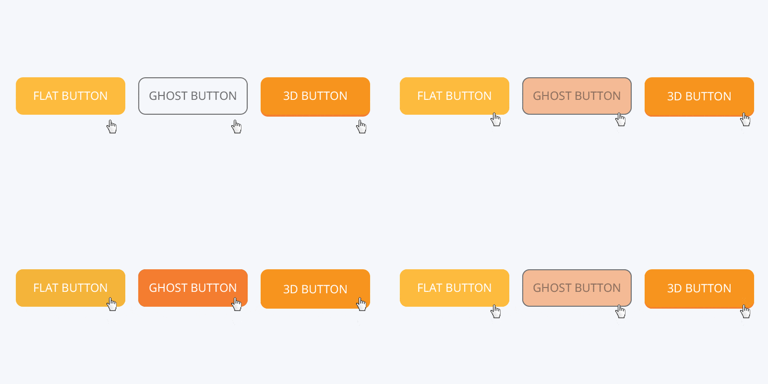
While everyone remembers the gaudy, shining buttons which crowded out the layouts of so many websites throughout the 2000s, designers have universally moved away from such heavy-handed techniques. Even including a slight bevel or contour has become outmoded through the adoption of flat and responsive design.
The movement towards simplified UI suggests an opportunity to separate content from its vehicle. Don’t ruin a beautiful photo of a canyon sunrise with an obtrusive button. Make the most of your interface by incorporating subtler navigation options.
Hero Images
In the spirit of highlighting your content properly, we should expect to see a reduction in homepage carousels, (often referred to as ‘sliders’). Beyond being a questionable SEO practice, it dramatically increases page load time, and fragments your audience’s attention.
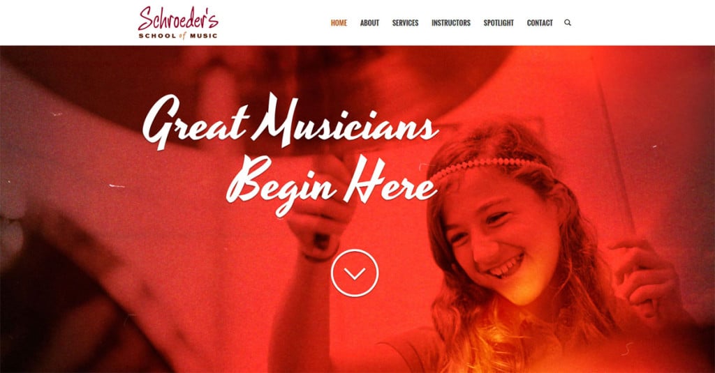
Instead, focus on a singular message or goal. Want to sell baked goods? Show them a donut and let their salivary glands do the rest. Steer clear of sterile-looking stock photos. Shoot for authenticity.
Bold Color
The introduction of modular layouts has brought with it a return to using color as a design element. Though a relatively new trend in web design, this is a classic Swiss graphic concept dating as far back as World War II. Don’t feel obligated to fill every page header with a scrolling parallax background or a bokeh texture. Certainly those elements have their place, but try to approach your UI from a simpler standpoint.
Including striking color behind your page headings is a great way to elicit a powerful emotion from the user without having to rely on the perfect picture. While strong colors should be used selectively, including vivid accents will prove to be a long-term trend over the coming years.
Remember to Say Something
The concept of meaning often gets lost in the shuffle when we talk about design trends. It’s critical to remember that, as designers, we are communicators above all else. Don’t shoehorn a trendy style into a brand which can’t accommodate it. Research your solutions and plan ahead. Make sure you are serving your client’s brand in the most effective way possible, and leave a lasting impression on anyone who views your work.
Sources:
