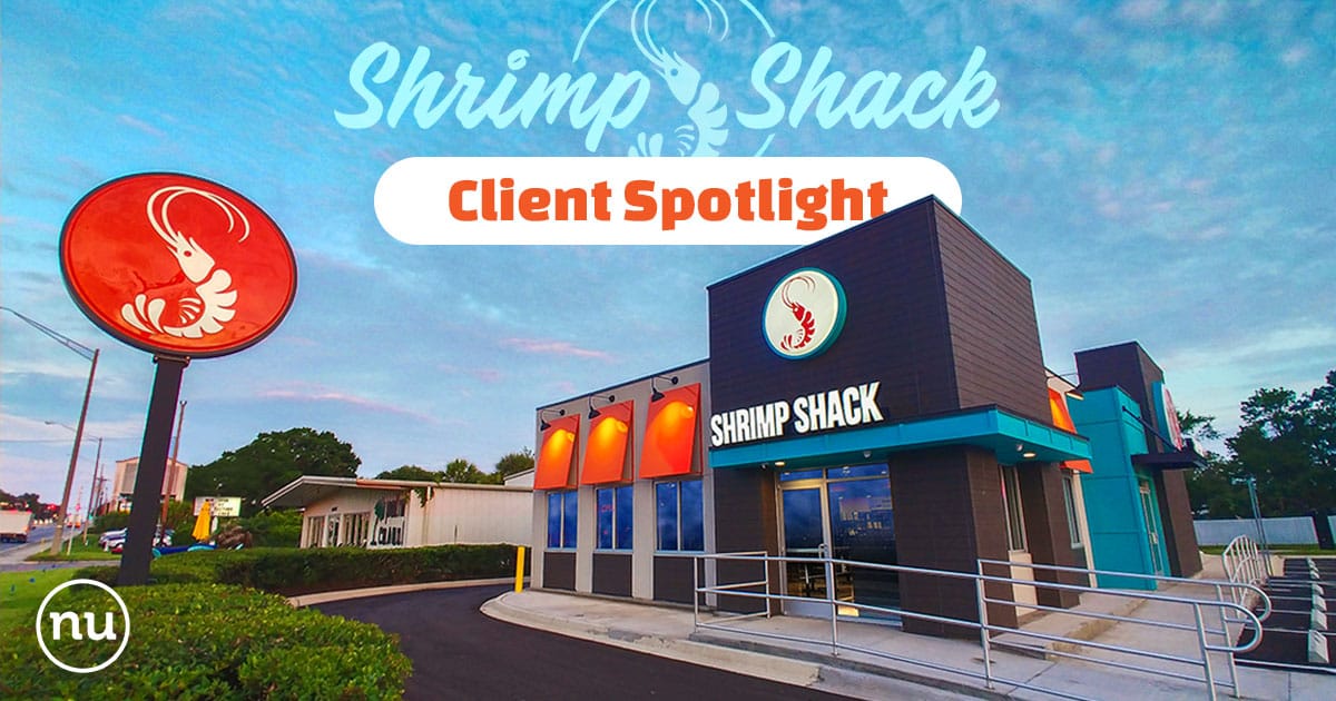
In the Spring of 2019, our agency earned the exciting opportunity to work with the Shrimp Shack–a small but thriving fast casual seafood chain in Jacksonville, Florida. We were excited because while these types of accounts can present a few hurdles, the challenges they present are typically the most fun to solve. We were recommended to the client by an architecture firm that was in the process of designing a new, modern look for the restaurant’s flagship location. However, this buildout was missing some critical details such as brand colors, approved imagery, type treatments, material textures, and (most importantly) a polished, updated logo that better represented where the brand was headed. Following their acceptance of our sweeping rebranding proposal, our ongoing relationship with Shrimp Shack began.
Institutionalizing a Local Legend
The first hurdle we came to was that this company was already well-established with two locations in their home market and a strong base of die-hard customers. It would not be inaccurate to describe their loyal following as ‘cult-like’ and when you see the line of cars that form around their buildings seven days a week, this becomes all too clear. The brand’s original logo, while fairly cute and charming, was a limiting factor for them. An image of a cartoon Shrimp surrounded by blocky titling had carried the brand to that point but was not an example of the scalable design systems that successful fast-casual chains rely on. Due to the rather juvenile appearance of the original mark, the company had also struggled to appeal to as broad an audience as they wanted, especially within the millennial demographic.
 With abundant research of their industry in hand, we immediately went to work on creating a visual brand system that elevated the organization through sophisticated design thinking. From colors that inspired hunger to typographic systems that allowed for maximum flexibility, Nuera produced the logo and icon system that would serve as the foundation of their new visual brand. Their original cartoon mascot “Shrimpy” (as he came to be known) was preserved as the permanent icon of their “Lil’ Shrimps” menu and a new, modular visual brand system was designed for adaptive scalability.
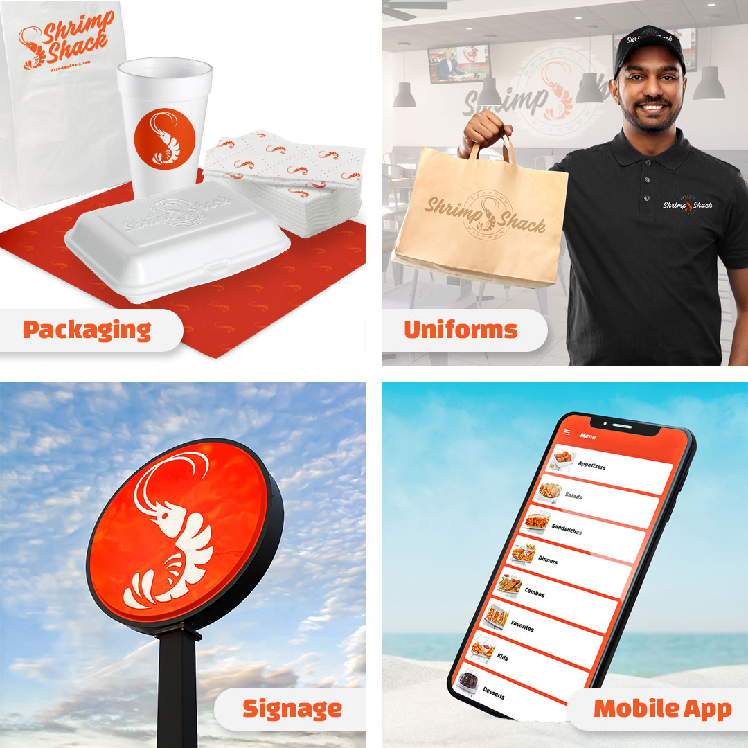
But our work didn’t stop there. The experiential branding needs of a fast-casual restaurant are never-ending so we observed granular detail in designing everything from employee uniforms and packaging to menu designs, product photography, and even the Lil’ Shrimps placemat menus (can you help Shrimpy find his way through the maze?). We even assisted their architects with details inside the dining room and the location’s exterior signage. The final jewel in the crown was the relaunch of their website, which massively expanded their digital footprint to be every bit as powerful as their real-world presence. Following months of work, we formalized all of this into one of the largest visual brand guides we’ve ever assembled, and together we kicked off the new chapter for the Shrimp Shack team.
That’s One Jumbo Shrimp…
With the new brand deployed, Nuera took over the management of Shrimp Shack’s social and digital channels in March of 2020. As you might recall, this was also the month that the world collectively locked down in reaction to COVID-19. As we all settled into our new work-from-home roles at Nuera, we braced ourselves for the ultimate learning curve: how to deliver growth for a restaurant brand through a time of crisis.
Though the kickoff was almost comically timed against the early stages of the pandemic, we worked in lockstep with our partner to adapt to their real-time challenges during those uncertain times. Through their nimble operational awareness and our scrappy marketing maneuvers, Shrimp Shack didn’t simply survive the pandemic, they thrived!
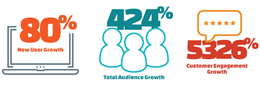
“This was honestly one of the greatest investments our business could have made when choosing a marketing company.” -Nate Abosini, Owner
Smooth Sailing Ahead
Last month, after dozens of prerequisite projects and years of development, Shrimp Shack finally re-opened their doors at their freshly renovated flagship location in Orange Park, Florida. The announcement was met with resounding fanfare from their loyal customers and once again, they were pleased to see the line form around their beautiful new location. We’re very proud of all we’ve been able to do to help this local business and are excited for the growth years that lie ahead!

