The question of how to choose the right colors for your brand is important in order to develop an effective brand identity. While design considerations like typography, placement, and imagery are all vital to capturing a company’s essence, color can often be your most powerful tool. Color uniquely communicates a wealth of information to an audience in a purely subliminal way. It is known that as much as 60% of a customer’s first impression is tied to the colors in use. In some instances, it is even possible to convey entire concepts through an artful use of hue and tone. From selecting an appropriate palette to the application of use, here is a process that has helped us identify a clear course when establishing or redesigning a brand.
The Psychology of Color
It’s important to gravitate towards making informed and data-based choices. But when it comes to abstracts like color, this philosophy can become a little nebulous. You may be able to clearly identify your target demographic, but without a greater sense of neuromarketing, you’d likely become lost. For instance, there is a long history of using the color pink to sell nearly exclusively to women. But after generations of its dogmatic use in marketing, to simply assume pink is the color all women gravitate towards could be construed as lazy, ineffective, and sexist.
It’s important to employ the full power of the color wheel and understand the power behind the shades and hues. This is by no means a new concept, but it can be overwhelming to look at the world around you and notice how seldom brands use color as a starting point. Recognize that what appeals to us personally has little bearing on how we should approach an outside demographic. While the idea of working on an exciting new tech startup with bold, bright colors is an attractive one, not every brand can be so visually dynamic. One conundrum that the owner of a 3rd generation locksmith might face is figuring out how to best capture their subtle trustworthiness. A non-profit organization might ask themselves what color easily captures the heart of their donor base.
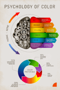
As a reference, the accompanying infographic gives you a surface-level understanding of how we apply these standards to achieve a more immediate connection.
Choosing Primary and Alternate Colors
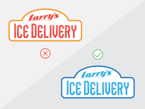
It can be a delicate balance finding the right palette for a given audience. There is a bevy of considerations, not the least of which is differentiating from your brand’s competition. Sometimes an out-of-the-box concept can work, but more routinely brands have to be creative in a narrow space. On top of that, certain industries simply require the presence of specific shades and hues. For instance, you would have a very hard time conveying what an agricultural company does without using the color green. Or you might try to sell bags of ice without using the color blue, but probably not successfully.
Using the insights you gathered from the color wheel, select a primary color. This is the hue that will carry the bulk of the brand’s weight. This color tends to live in the middle of the contrast spectrum and usually works well as a base or an accent, depending on its context. A simple pairing with some text or imagery and it should already be pretty clearly conveying the intent of your brand.
Next, select your alternate, or accent color. This seems to be where most novices fall apart, because while there are certain guidelines to color pairing, this step is extremely subjective. At its core, it has to feel right. It must support the primary color, without stealing the spotlight. Ideally, the addition of a secondary color should convey a more complete sense of tone for a brand, and lend clarity to its message.
Creating a Palette
Once you’ve selected some core colors, it’s time to create a useful palette. These supporting colors are not just chosen to take up space on a style guide, they are the specialized tools designed to answer questions before they arise. These hues should be well balanced and collectively represent the attitude of the brand. This is best achieved through a careful observance of contrast, saturation, and tonal diversity.
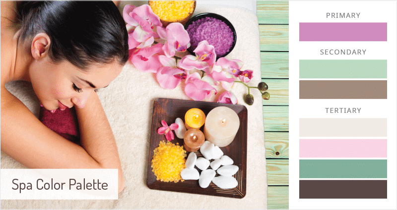
A good palette should feature anywhere from 1-3 tiers, with 2-5 colors per tier. These groups help establish the visual hierarchy for a brand, and can feature many variants of the primary and secondary colors, as well as other supporting tones. In practice, you’ll likely only actually have to use 2 or 3 of these colors regularly, but being prepared for the unexpected can help decide tough design choices for your brand down the road.
The utility for creating such a spectrum should be clear to anyone who has ever had to create a branded website or print document. At a bare minimum, you must consider selecting colors for heading and body text, active & inactive link colors, backgrounds, overlays, footers, and on.
Color being largely a universal language, there are many online tools to help you create a beautiful palette. Most of these are based on a standard 5 color palette, but some allow you add more or less. Here are some powerful free sites to help you find your own inspiration.
Adobe Color
Formerly called ‘Adobe Kuler’, this rich and powerful generator offers a wealth of options including relative color relationships and how your palette applies to the full tonal spectrum. It also has a lively community of users whose work is showcased on the site. Visit site >
Coolors
This fast and fun generator gets right to the point, and the interface is intuitive and easy. Sharing and exporting your new palette is also incredibly simple. Visit site >
Color Palette Generator
This spartan interface by DeGraeve.com is a useful tool if you need to quickly identify the colors of a specific source. You simply offer it an image to process and it spits back out two 5-color palettes, one in the dull spectrum, and one in the vibrant. Visit site >
Canva Color
Want to learn more about how your audience perceives color and find examples of that utility in use? Look no further than Canva Color. This is a really data-driven tool and aligns nicely with a sense of purpose when it comes to color selection. Visit site >
Creating Your Visual Identity
Once you have created your palette, it’s time to complete the work of your visual brand buildout. Now that you’ve taken the proper steps to choose the right colors for your brand, the final palette should make any design choices much easier and save you a load of mental anguish. We’ll cover more on this process in future articles, but in the meantime, we hope this glimpse into our method will help guide your creative process towards a positive end result.
Sources:

