It always starts as such a seemingly benign note by a well-intentioned client: “make the logo bigger.” So simple, right? What could possibly be objectionable about that? The problem is rarely the request itself, but the impulse to make it. Many tropes have emerged through the years which comically pit a client and a designer against each other over seemingly inconsequential details. But regardless of which side of the client/agency line we fall on, we believe in our organization, and what better symbolizes that allegiance than our brand’s beloved logo? This post aims to answer that question by turning the original request inside out. Let’s explore why exercising a little well-placed humility will always serve your brand better.
A Logo Does Not a Brand Make
It drives us a little crazy when we hear anyone use the words ‘logo’ and ‘brand’ interchangeably. It’s an important distinction whether you’re working on something as simple as the company letterhead all the way to a national advertising campaign. While these ideas are related (and you can’t have one without the other) a ‘logo’ is a bit of graphic design; the centerpiece of a visual brand; a mark. A ‘brand’ is the grand sum of an organization’s entire identity. It’s important to remind ourselves that no matter how amazing our brand marks may be, no empire was ever built solely on the back of a well-designed logo. Some might even argue that a logo doesn’t even rank among the most important elements of a brand! Something as intangible as your reputation is worth much more–all by itself–than the size of your logo in your own marketing and advertising.
Lead To Your Brand, Not With Your Brand
That last paragraph may read like sacrilege at first glance. “But what about Nike? What about Apple? What about STARBUCKS?!” I can hear you screaming. Though these are all world-famous brands that feature their beautiful logos prominently on nearly every available surface, very few of us are fortunate enough to work for paradigm-shifting lifestyle brands that benefit from this kind of marketing. Additionally, even for these brands, there’s a less-visible strategy being practiced at all times.
Starbucks doesn’t necessarily brew the best coffee in the world, but they have unquestionably one of the most well-trained audiences in the marketplace of ideas. New Balance may make comfortable shoes, but they don’t have the coveted Air Jordans; and as anyone who has ever held an iPhone and an Android device, we all know who sets the standard for intuitive UX. But for small- to medium-sized businesses, they have more finite information and a more immediate need to engage their regional audiences through their products, unique points of value, and customer experiences which take precedence over their own mark.
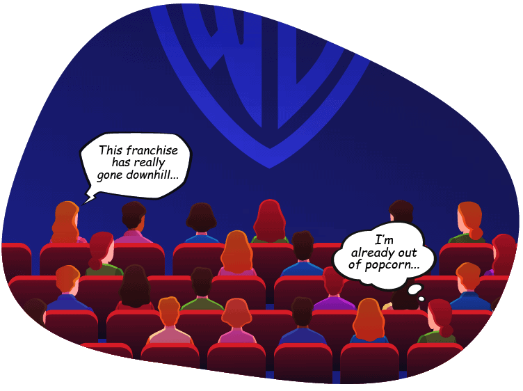
 Imagine going to see a movie and the Warner Brothers logo was on screen for the first 30 minutes. I don’t care how attractive or nostalgic you find that giant “WB,” you’d never pay to sit through that movie. Focus on pairing engaging content with positive user experiences and you’ll not only lead more potential customers to your brand, you’ll build a more valuable, loyal audience along the way.
Less is More
Though we speak about it constantly, less really is more. Negative space is just as critical as the content itself. Without healthy marginal areas, the eye is easily confused and your brand’s message can become lost when the layout becomes too busy. We should avoid the impulse to give our logo so much daylight that it distracts from our central message. Potential customers don’t want or need a brand shoved in their face. A user would always prefer to be passively reminded which brand is engaging them as opposed to having to worship at the altar of that brand’s marketing department. When designed correctly, a consistent visual brand system is invisible to the user and projects your message instead of forcing it to play second fiddle.
If there’s a simple takeaway here it would be that attention spans are limited and we must make the best use of them. Don’t let your passion for your visual brand distract you from your marketing’s central mission–attracting, engaging, and serving your target audience. While a logo is vital, every element of your marketing works better with balance.

