At its heart, this post is a discussion about how to improve user experience on the web, however, I want to zero-in on a single element of that ever-advancing school of thought: the utility of minimalism in web design. I’ve been mulling over this subject in my head for a few years now and I’m reminded of it every time I use the internet for basically anything. It’s such an obvious topic that it barely seems worth a mention, yet we all experience it constantly. I’ll visit a business’s website and find myself immediately overwhelmed by not only abundant primary content, but a cavalcade of chat support windows, exit popups, and ancillary advertisements for the site I’ve already decided to visit. These kinds of hard-selling web experiences are a holdover from the dawn of the internet and persist in a panic-inducing volume to this day. Beyond being annoying, these techniques also tend not to work all that well and turn even the most luxurious brands into ugly, aggressive spaces that strip a brand of its refinement.
That shared, this post is not truly about minimalist design, because we don’t tend to practice true minimalism at Nuera. Instead, we try to adopt a more pragmatic mindset inspired by the principles of the theory which one might call focused or simplified. Sadly, neither of those terms are part of any recognized design lexicon, so for lack of a better term, we will stick with minimalism as our shorthand.
Why Minimalism is Important to Designers
Though the philosophy became popularized in the west through modern art and architecture the better part of a century ago, it’s not hard to imagine how the concept has evolved to be applicable in 21st-century digital spaces. Pioneering modern architect Ludwig Mies van der Rohe famously said “less is more,” and this principle remains vital within any type of interface design. Just like the 20th century’s physical office buildings or shopping centers, whose success depended on the optimization of open floor spaces, digital interfaces rely on similar principles to process their users. Chiefly, this involves reducing the number of options available to a user at a given time. If you walked into a department store and radiating out from the entrance were ten different lanes, you’d never find what it was you came to buy. Thankfully, when you walk into a real-life department store, even with its vast sea of products, you’re typically only presented with moving forward, left, or right–clear without having to lend much, if any, thought.
“Minimalism is more than just preserving negative space–it’s about using space in a meaningful way.”
I chose the metaphor of the department store for good reason. Few of us would initially describe a shopping center as ‘minimalist’ but, in a space with such heavy concentration of products, it is the negative space that defines how one feels and moves through that environment. Minimalism is more than just preserving negative space–it’s about using space in a meaningful way. At Nuera, we focus on crafting a narrative that guides a user through a brand, product, or service to a desired engagement point. This could be purchasing a product, booking a consultation, or even just learning more about a given organization. Regardless of the desired outcome, we keep the user’s attention focused and aim to never overwhelm them. In this way, minimalism helps to educate how we can simplify a concept down to a point of irreducible complexity without having to sacrifice the overall style of the layout. To put it another way, there is no reason that harnessing the core tenets of minimalism has to involve boring content floating in a sea of white.
Less is More of a Guideline…
Presumably, you’ve read this far because we agree that providing a focused web experience for users is a common goal. But how is that focus achieved? Though there is no universally agreed-upon definition of what minimalism means, when we think about designing for the web Nuera tends to observe five principles that educate our process.
1 | We should always strike a meaningful balance between negative space and content
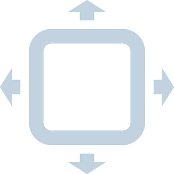 This is where Nuera tends to deviate slightly from traditional minimalism. Though we don’t typically design many websites with blank, white backgrounds, it’s our belief that even the densest web content can still be presented in an accommodating and digestible way. ‘Irreducible complexity’ might mean very different things to different brands’ content, but as long as the design features a tasteful balance between emptiness and visual saturation we can maintain a minimalist mindset.
2 | Typography and color are as important as feature imagery
 Though the general advice in minimalism is that one should be ‘sparing’ with their use of color, we prefer to use the term ‘intentional’ instead. Many brands benefit from liberal use of color and we are happy to approach that paradigm on a case-by-case basis. A similar principle holds true for typography. Our agency has a deep love of type and so it tends to be expressed in our creative work with equal weight to the featured visual imagery. But with the introduction of these bold tactics, we must constantly be zooming out to apply balance to our designs. When we go bold with color or type, we tend to soften the dynamics of the other elements within a layout to provide the necessary breathing room for the user’s attention.
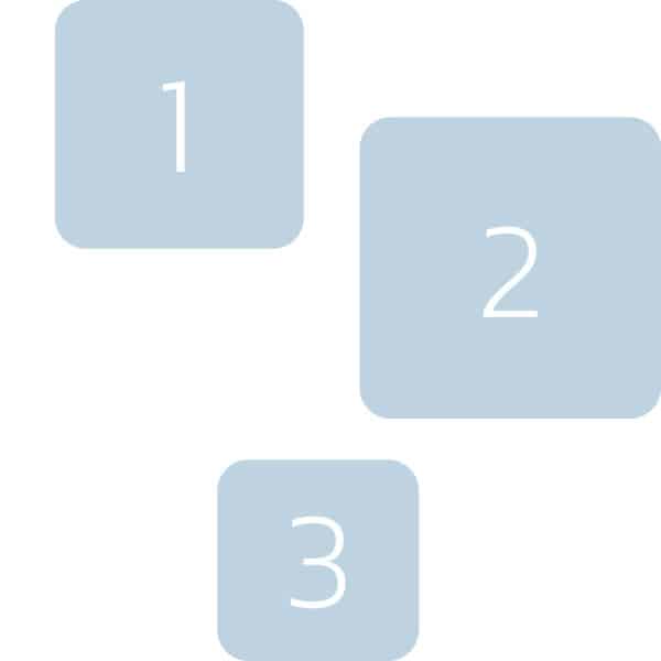
3 | Visual and structural consistency is vital
 Though this bullet gets a little buried under the sexier points of design, it’s arguably even more important than color, type, and imagery. The human mind is exceptional at identifying patterns and this is why having a consistent visual system is crucial in web and interface design. The components of your layouts need to not only work as individual vignettes, but they need to fit together into a complementary and replicable system that users may rely on to move through the space. A perennial example of this type of structure is the very top of a website’s homepage. At a minimum, we expect to see the brand’s logo and some kind of navigational system. This system follows a user through the whole site and should rarely, if ever, deviate from the convention along the way. Most users can figure these systems out in real-time, but it is the simplicity, continuity, and (hopefully) elegance of the structure that will define a user’s experience.
4 | We should use narrative to keep a user advancing
 One of the most intangible elements of web design is narrative and it can be a tricky thing to do well. Let’s assume you already have a decent grasp of your brand’s voice and goals, you are still sitting on the starting line of what goes into your on-page narrative. Like most of the advice in this section, we can apply minimalism to our narrative through the balance it presents within the layout. When to challenge users, or create calls to actions, or provide denser bodies of informational text can all be looked at as part of your narrative, and it is surprisingly easy to get carried away with these elements. Approaching your website’s narrative through the lens of irreducible complexity will help identify elements that are superfluous or overwrought within the user experience.
5 | We should never overwhelm a user with too many options
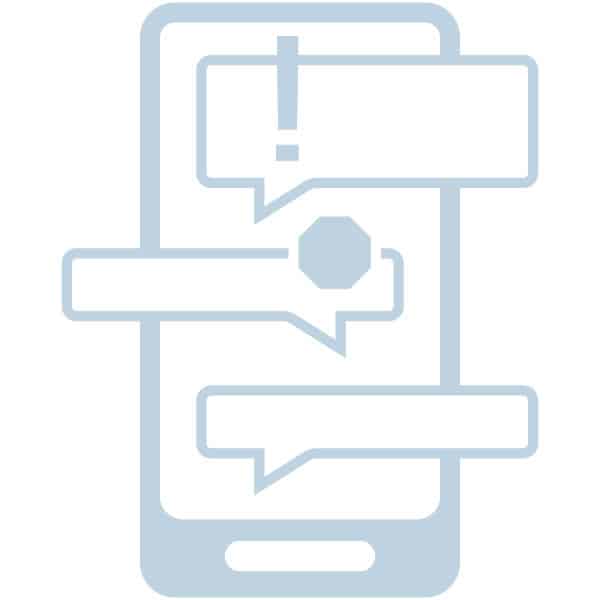 If I needed to summarize this entire article with a single sentence, that would be it. Our minds can accommodate a lot of input at once, but it remains a mystery to me why brands insist on pushing their users to the upper limit of this capacity on their own sites. Whether it’s sidebar ads or email signup requests, many websites are littered with unnecessary distractions. It’s our philosophy that a minimalist mindset should be the reigns that allow us to hold back the impulse to clog up an interface with options that will result in more confusion than conversions.
Form + Function = Focus
At the end of the day, we could be creating a website with thousands of products or a no-scroll landing page, and the tenets of minimalism would still apply. It is simply our suggestion that modern designers strip away the faddish trends of the mid-century movement while retaining the objective values in a pragmatic and modern capacity. While there is no official rulebook, we can all look to the adage of “less is more” and take away our own unique interpretations of what was once a pretty radical philosophy. When we seek balance in the dance between form and function, we do so with the user in mind through a vested interest in making their experience as focused, simple, and effortless as it can be.